Hello!
It’s here! Week 6! Finally, I can reveal all the goodness that has been going on at No. 740 – otherwise known as our house! And I’m so excited to show you.
If this is your first time here, welcome! I’m Caireen, designer and lover of casual, modern interiors with a dash of mid-century modern style. With my husband Graham, and a small tribe of suppliers and trades, we have tackled and conquered a Master Suite renovation and re-decoration in our 1960’s bungalow for the One Room Challenge.
If you missed the earlier posts and would like to read through the back story, click below.
Week 1 | Week 2 | Week 3 | Week 4 | Week 5
Let’s head down memory lane and see what our bedroom looked like just six short weeks ago.
THE MASTER BEDROOM
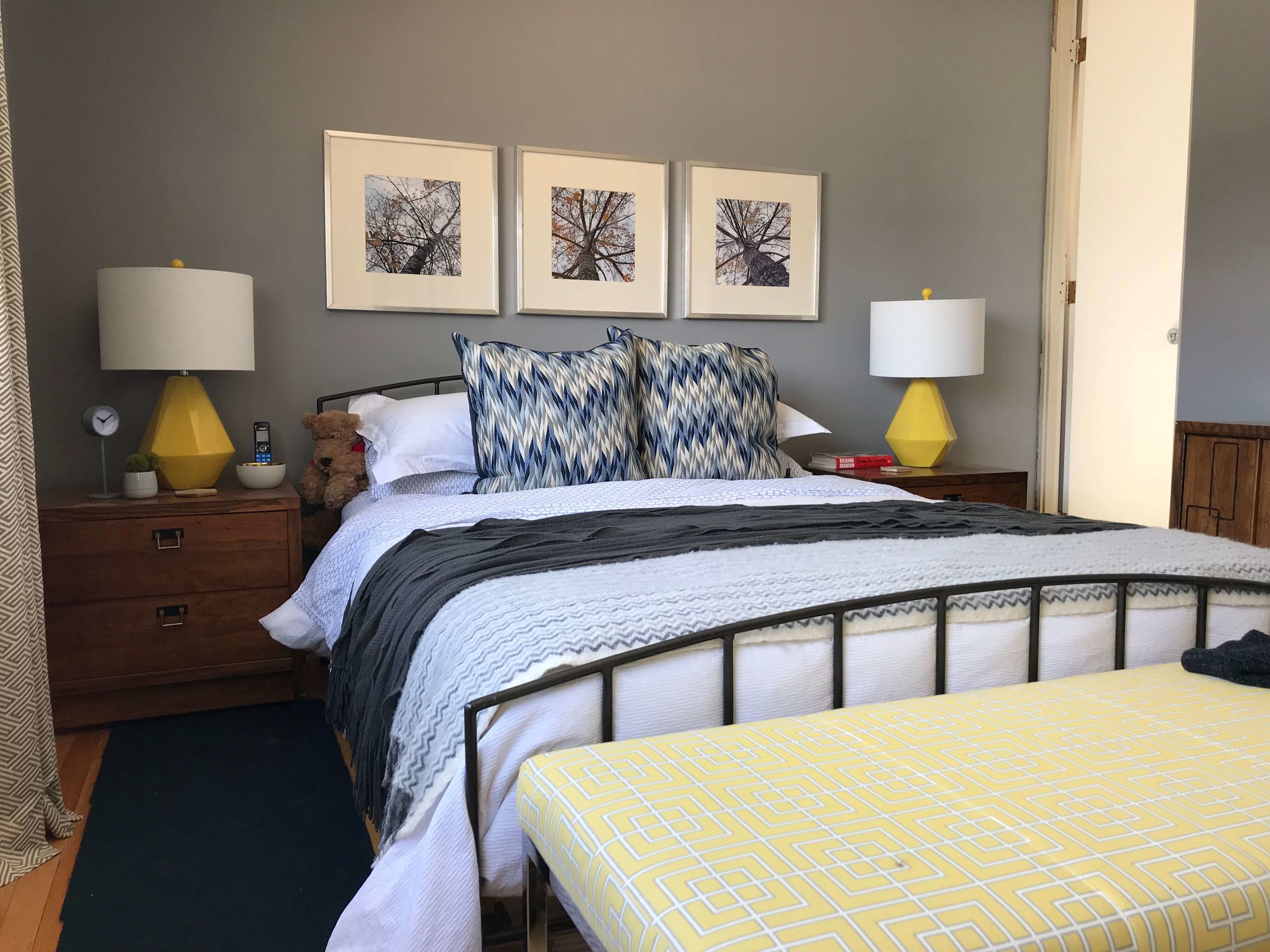
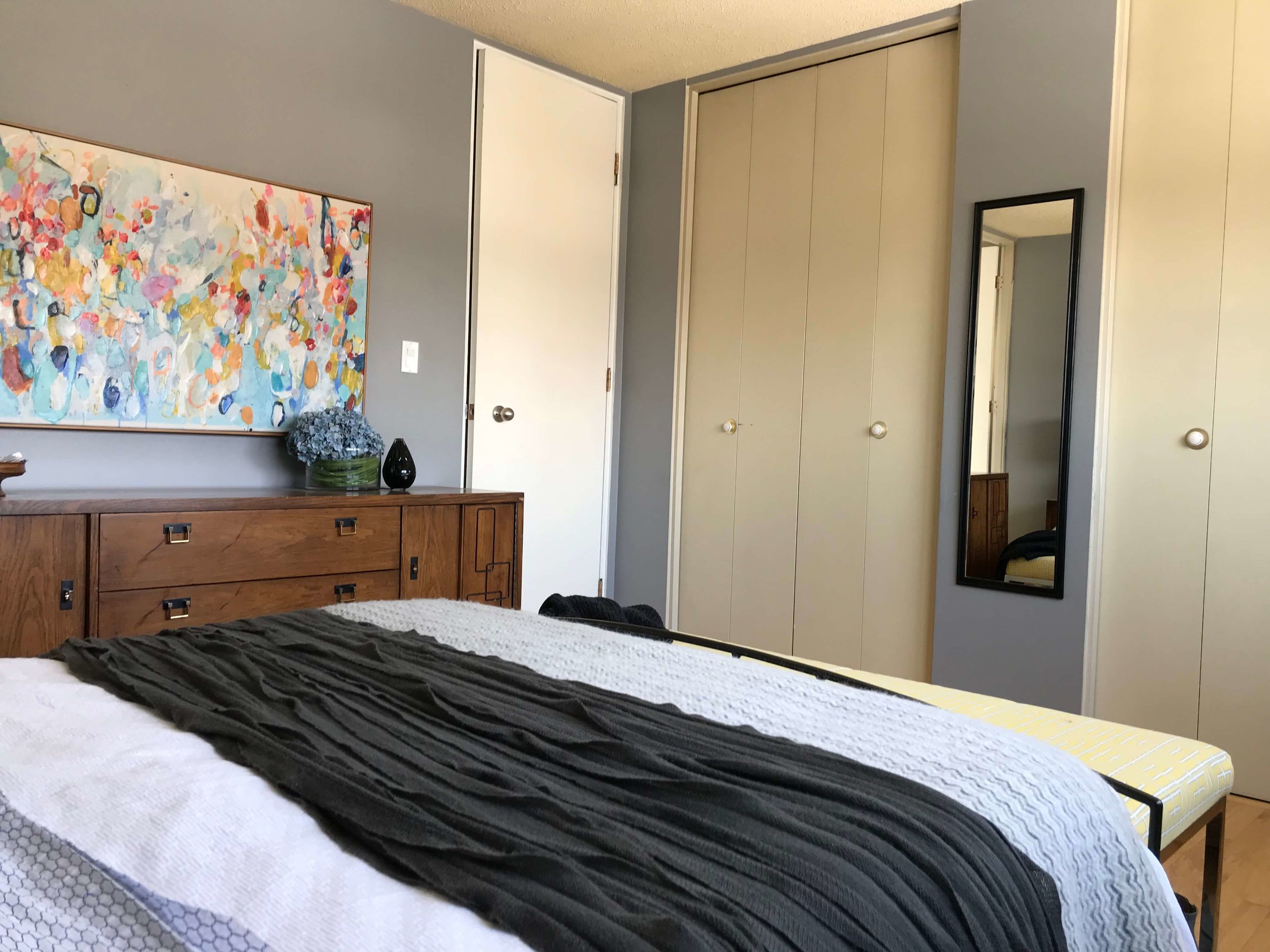
The master bedroom had become a collecting point for various pieces of furniture, art and lighting, none of which went together. And the original closet doors were a pretty ugly yellow/mustard/dirty cream colour – I’m honestly not sure what colour they were! Clearly nothing lent itself to a calm and restful environment.
Here’s the before:
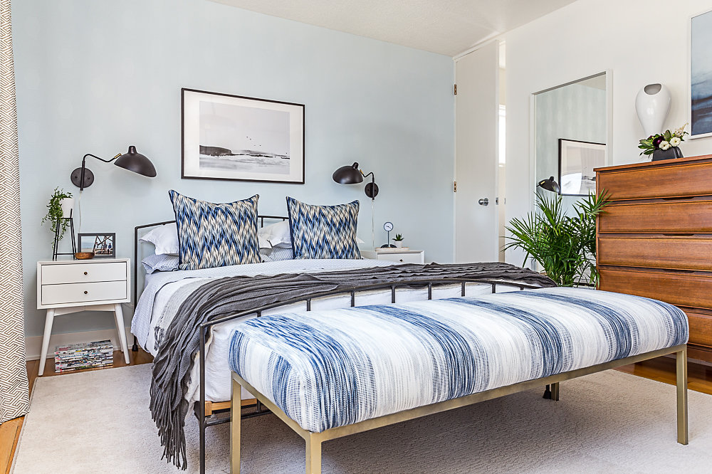
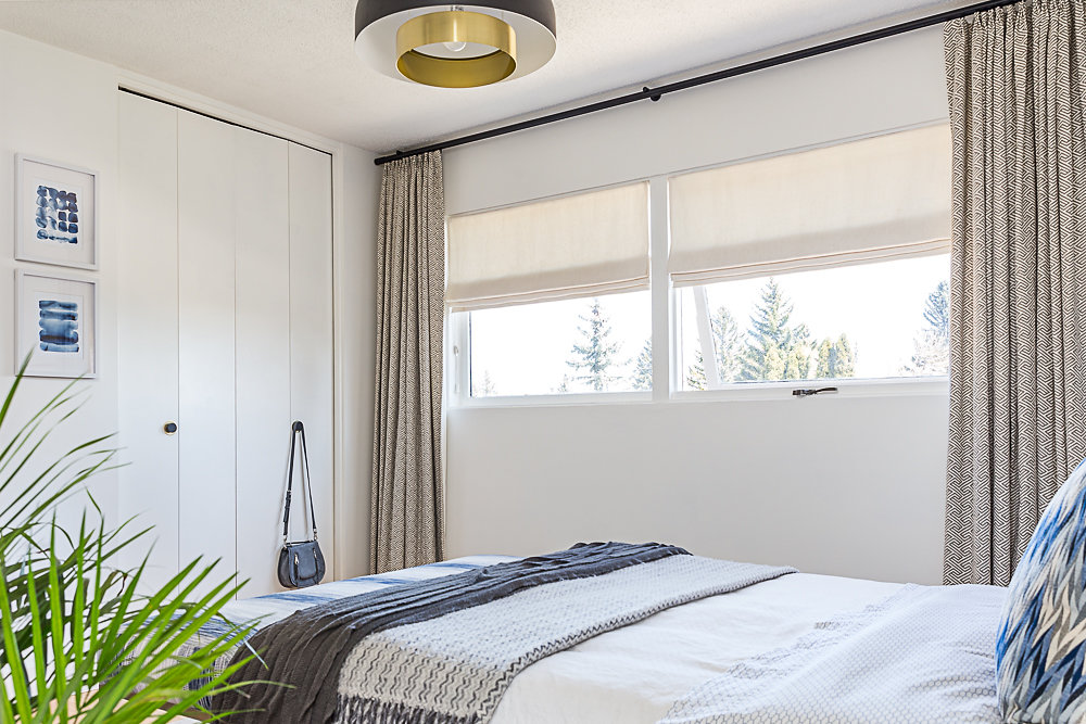
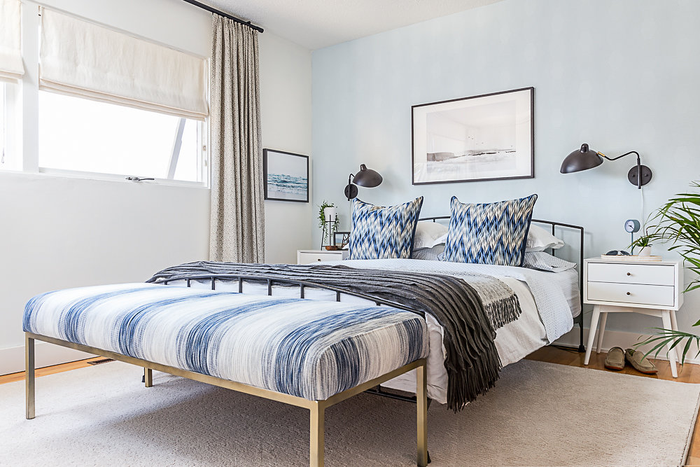
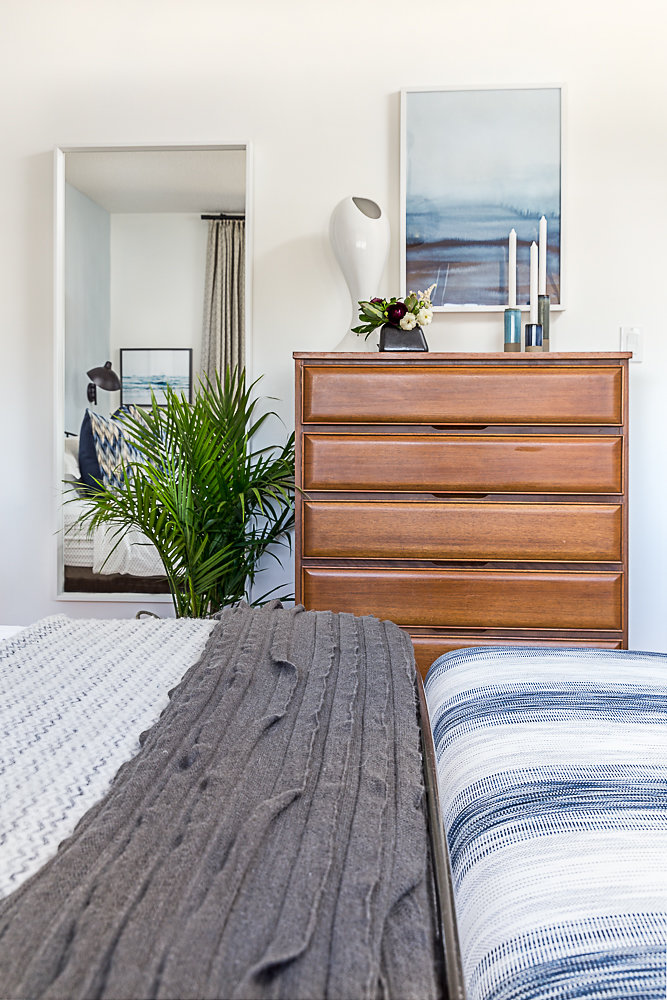
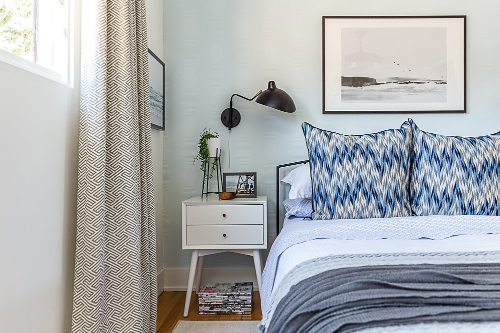
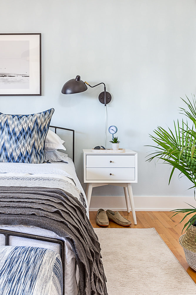
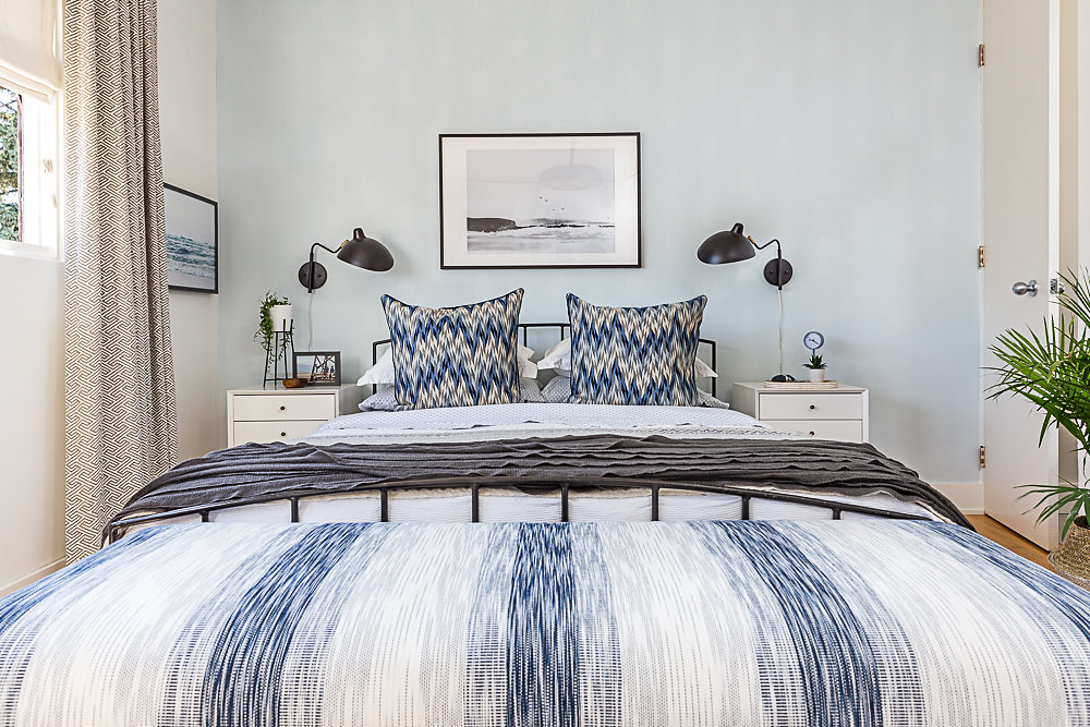
And here’s the after:
Gah! I love it! Biased I know, but it’s my room, and I’m allowed to be, right? LOL!
Our goal was to create a calm and serene space that felt representative of both Graham and I. We wanted the room to feel lighter both in colour and the visual weight of the furniture. It all felt very heavy and cumbersome. I’m blown away by the transformation we achieved with simply re-decorating. Funnily enough, very little in here changed, but the changes we did make had a significant impact.
The bed frame, a Habitat UK piece that we purchased over 20 years ago, the bedding, blinds and drapes all remained from the before and we re-invented the bench at the foot of the bed.
The layout of the room could not be changed due to traffic flow, but I knew by going with a shorter, higher dresser I could improve the ease with which we could access the bathroom. I can’t tell you how many times I have bruised my leg on the original dresser enroute! I’m delighted with the streamlined look of the new-to-us mid-century 5 drawer dresser.
A pair of leggy night stands that were narrower than our originals helped add to the airy feel and wall sconces meant we didn’t sacrifice table top space with this decision. Plus I now have plenty of room to stack my always growing pile of design magazines underneath!
Benjamin Moore‘s Simply White on the walls, ceiling and trimwork and Iceberg on the wallpaper got us the lighter, airier look we were after.
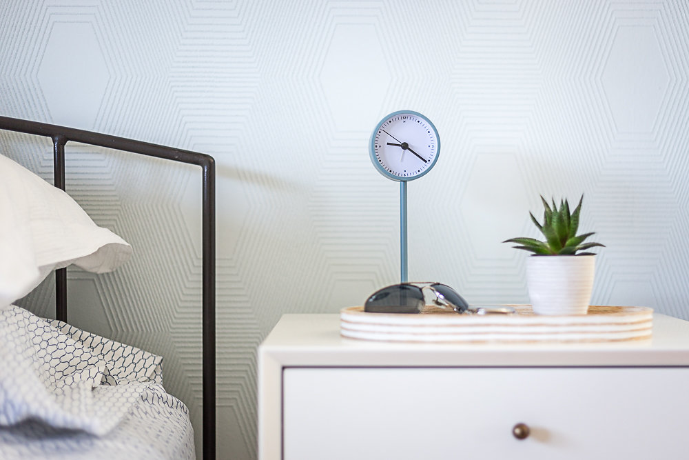
And let’s talk about that textured, paintable wallpaper for a moment. I was so nervous to paint it, but I love the outcome. The pattern is so subtle, the colour is perfect and it adds just the right amount of interest in the room without taking over. The beauty of it is that I can re-paint it if I want to change it up some time in the future. Not that I do. I’m kinda done with painting for a while…
All the art pieces in the room are downloadable printables through various Etsy stores (see my source list at the end), which I had printed at my local office supply store and framed in simple IKEA frames. The seascape over the bed reminds me of the beaches back in England, and I’m totally enamoured with how it looks with the blue wall behind it.
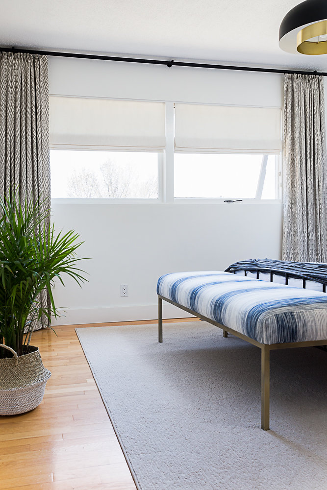
And how good does the bench look now that it has more foam, new fabric and soft gold frame beneath?
The room is grounded with a roll end of carpet from CDL that I had bound to my dimensions – check your local flooring company if you are in the market for a cost effective area rug. It is a great solution when your budget is tight. And the blinds and draperies from Tonic Living look so much fresher against the white walls than they did against the original grey walls.
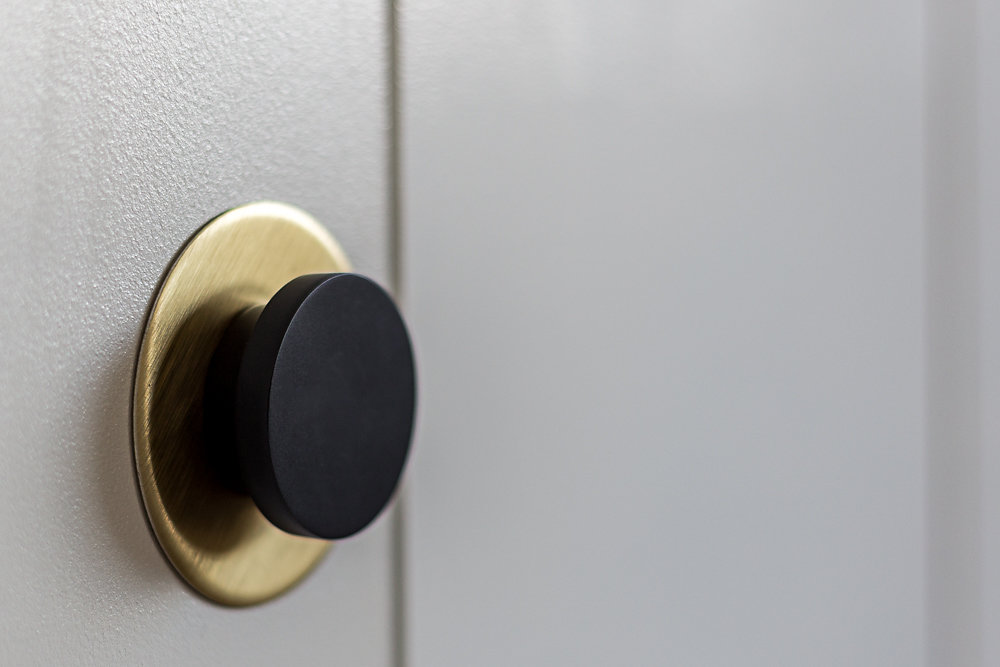
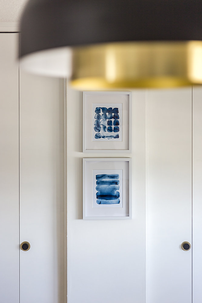
The closet doors got a simple makeover with paint and new handles from Emtek – I kept the original backplate which adds an interesting throwback to the original finishes in the home.
The ceiling fixture is so perfect in the space – I must confess I’m not sure how or why I lived with the pre-existing ‘boobie’ light for 17 years. This is a significant upgrade! LOL!
And finally we also beefed up the baseboard, a subtle change that I love, and it matches the rest of the house.
Ok, on to the teeny tiny pink bathroom.
THE MASTER ENSUITE
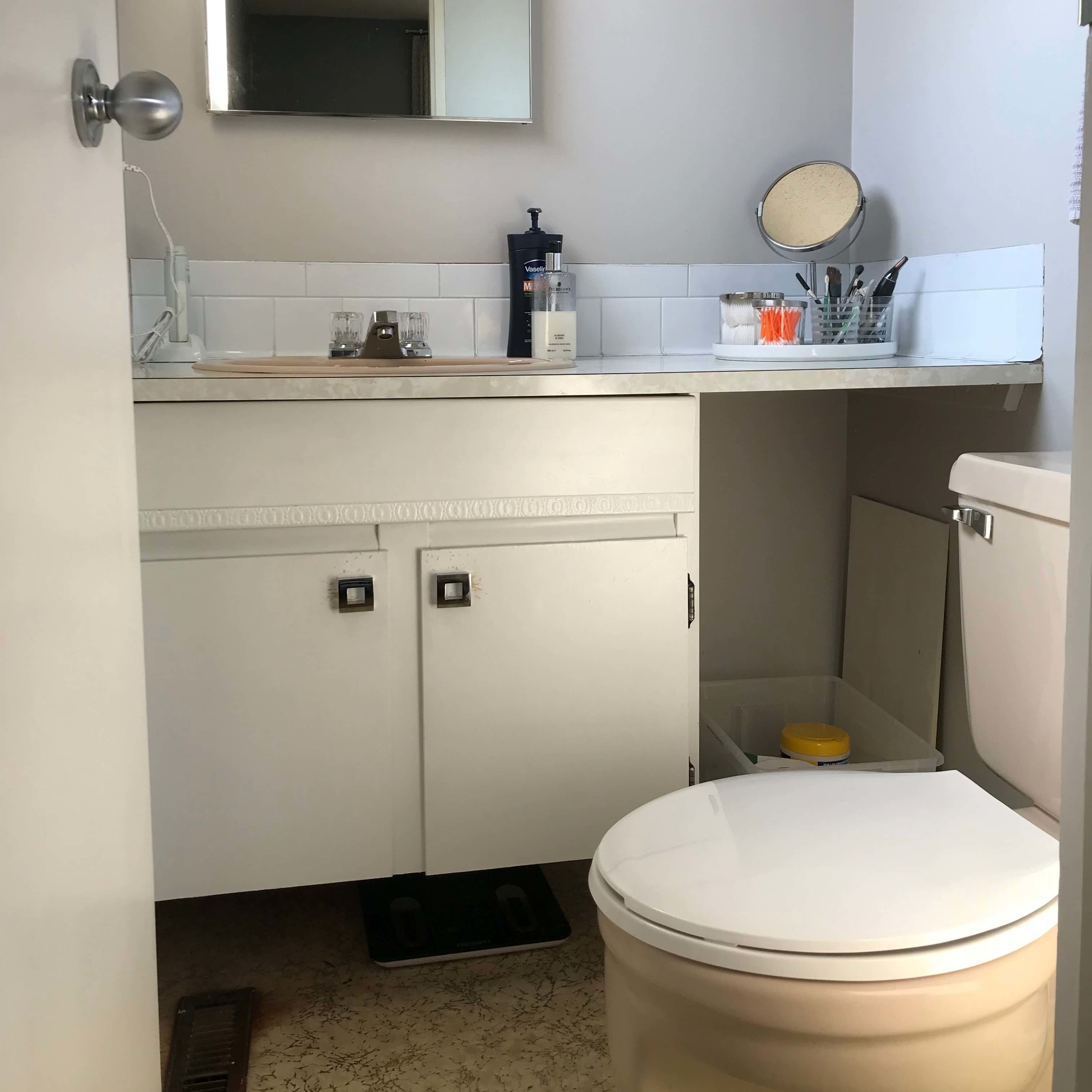
The teeny tiny two piece ensuite, that would stay a teeny tiny two piece ensuite but had to feel larger and function better saw an amazing transformation.
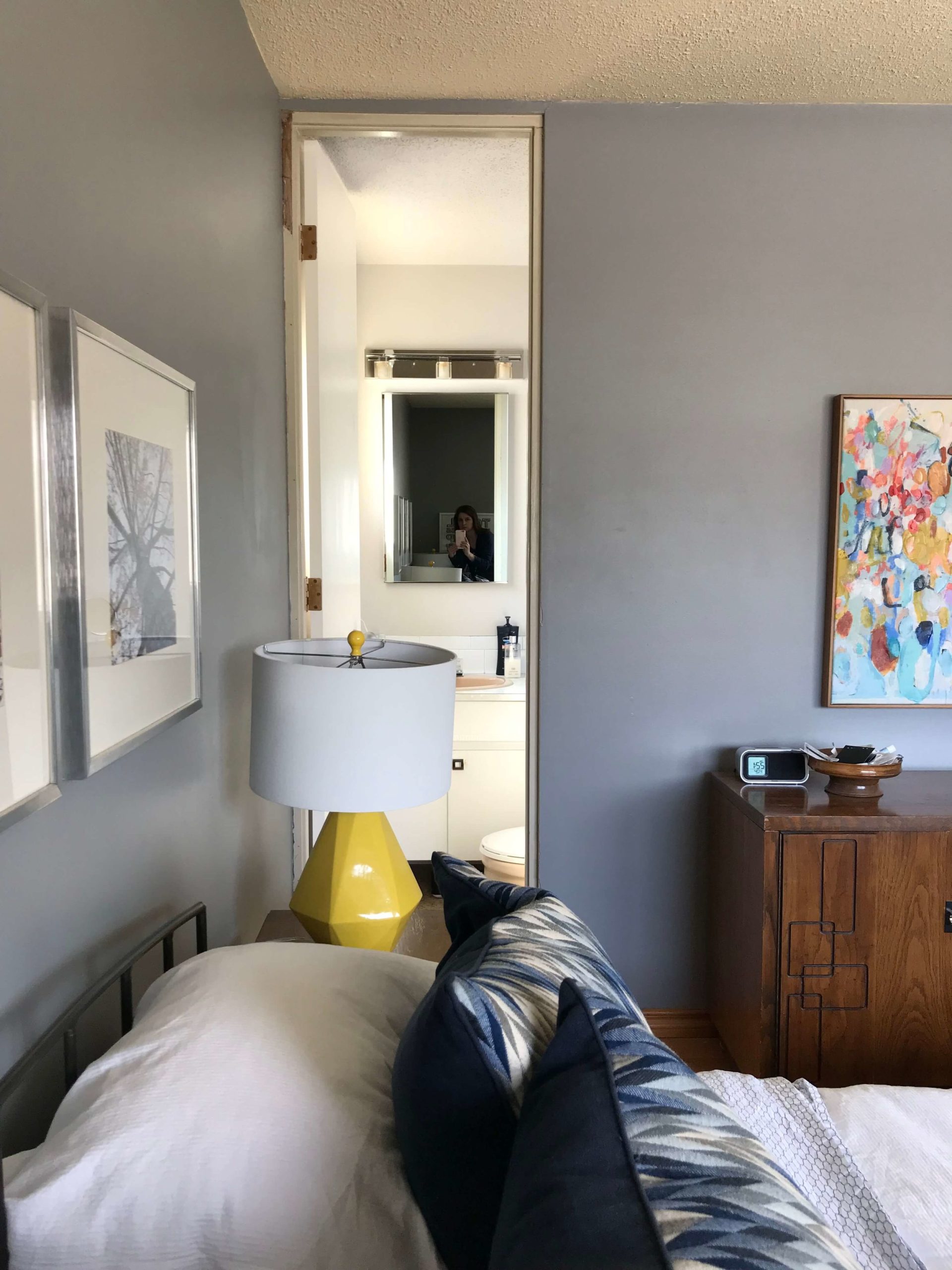
Here is the pinkness and dysfunction that we started with:
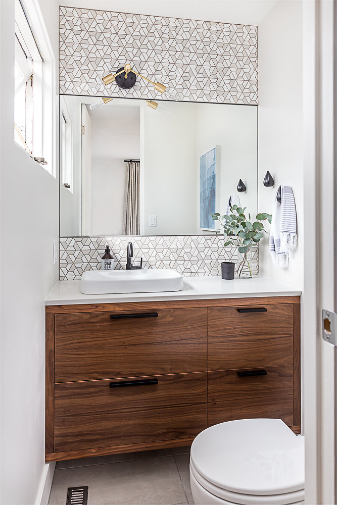
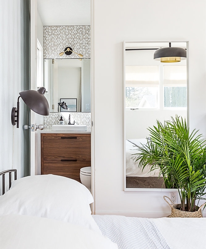
And here is where we finished:
Whoa, right? So. Much. Better.
We used a few tricks to maximize the space while not adding any physical square footage to the room.
By reversing the door swing so that the door opens out into the bedroom we gained valuable inches – I don’t miss doing a jig around the toilet and door just to clean my teeth!
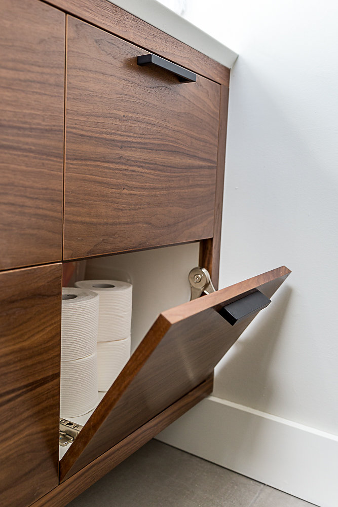
The beautiful walnut vanity created by Casa Flores I narrowed to 19″ from the original 22″ vanity to gain a little bit more floor space – and it does make a difference. My math skills were put to the test as the vanity drawers and flip down doors were calculated to open within a quarter of an inch of the toilet bowl and tank. Thankfully I passed! And that profile on the counter’s edge – one of my favourites!
We selected a round bowl toilet as it is less deep than an elongated version (as the name would suggest!), and this particular model has a very small tank – it’s perfect for the space. I wouldn’t normally say I’m enamoured with a toilet, but there is a first time for everything I suppose! LOL!
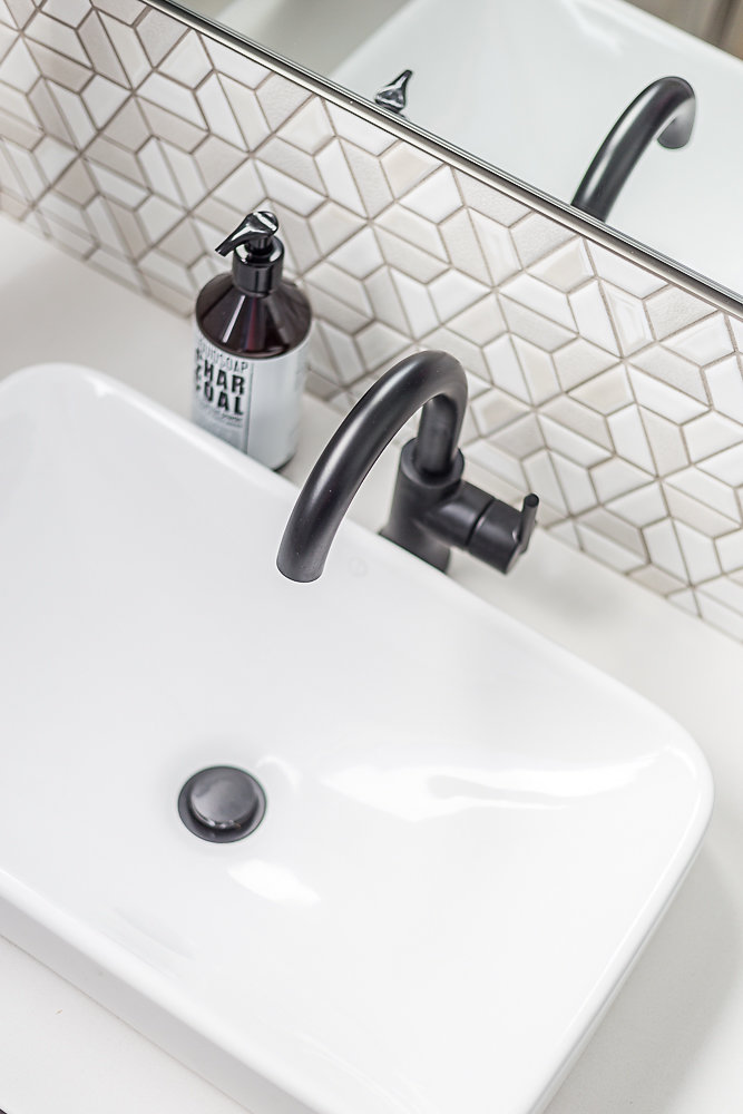
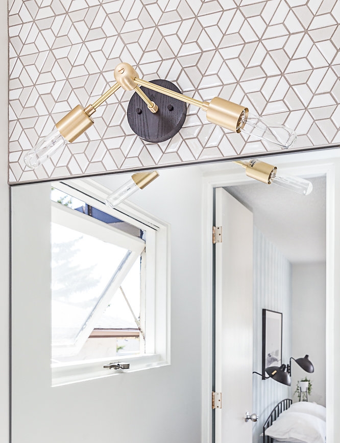
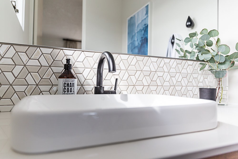
And then there are all the finishing details – honestly my heart skips a beat with the whole combination of sink, faucet, tile and the customized wall sconce from Worley’s Lighting.
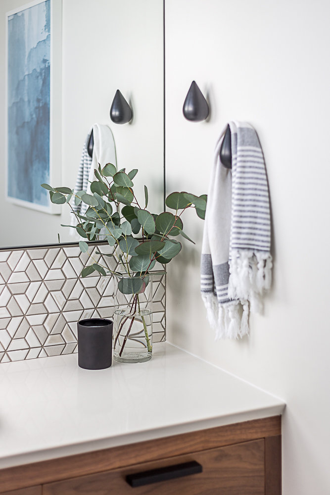
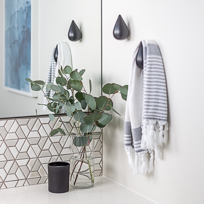
And these hooks are simply darling. Love, love, love them!
Finally the wall to wall mirror visually expands the space and also means that Graham and I can share the bathroom when we are getting ready in the morning. (I know, really? The two of us squeeze in here? Yup!)
Here’s another before and after:
The first night we slept in the room in its’ completed state felt almost surreal. It was familiar and unfamiliar all at once, but we both agree it’s totally us. I can’t put into words how great it feels to walk into our master suite every day, I almost have to pinch myself that it’s real! Note to self; don’t leave it 17 years to completely renovate a space from top to bottom!
IN CONCLUSION
I am so grateful to Linda of Calling It Home who organizes the One Room Challenge every spring and fall. What a great event to have been a part of.
I am also grateful to all my trades and suppliers (credited in the source list below) who accommodated my tight timelines and delivered their services with their usual smiles and attention to detail. It warms my heart to look around the room and see the work of people who have become so integral to my business.
Huge thanks to my photographer Lory Ros, who patiently took these great photos, edited them at lightning speed to meet the deadline, and captured the essence of the space so well.
Graham has also been a complete rock over these six weeks. In addition to pretty much giving me free reign to design our shared space the way I wanted, he also did the heavy lifting with demo, installing baseboards, moving furniture, installing light fixtures and plumbing. Oh, and of course he talked me down off the proverbial ledge more times than I can count! I could not have done this without him.
And to you too. Thank you so much for following along here on the blog, on Facebook and Instagram, and leaving encouraging comments, as I made my first foray into blogging and the ORC. It is so appreciated. And of course, feel free to comment on the reveal, as Graham and I would love to hear your thoughts.
Finally, remember to check out both the featured designers and the guest participants for the ORC. Pour yourself a glass of wine and peruse the results of all the creative work that has happened over the last six weeks. I’ll be over here doing the same!
Cheers!
SOURCE LIST
ENSUITE
Cabinetry – Casa Flores | Counter – Caesarstone, Fabrication – Alba Granite | Sink – Pearl Sinks through Alba Granite | Faucet – Delta through Wolseley Studio | Toilet – Toto through Wolseley Studio | Wall Tile – Tierra Sol | Floor Tile – Tierra Sol | Tile Installation – IGI Construction | Wall Sconce – Worley’s Lighting | Hardware – Top Knobs through Banbury Lane | Towel Hooks – Normaan Copenhagen through Guildhall | Mirror – Simple Spaces | Watercolour – | Soap Dispenser, Candle – HomeSense | Vase – My Own
MASTER BEDROOM
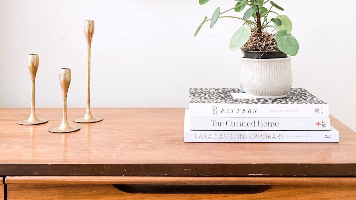
Ceiling Light – Nuevo Living through The Lighting Centre | Wall Sconces – Matteo Lighting through The Lighting Centre | Blinds + Draperies – Tonic Living | Drapery Rod – DCRC | Drapery Rod Installation – Jordana Systems | Area Rug – CDL | Paint – Calgary North Decorating | Dresser – Reclaim to Fame | Bedside Tables – West Elm | Wallpaper – Erismann through Campbell Dunsmore Group | Wallpaper Installation – Ron Dumbarton | Bench Fabric – Fabricut through Stewart Drummond Studios | Bench Upholstery – Calgary Custom Upholstery | Sea Rock – Dan Hobday | Ocean Photograph – Little Lady Print Shop | Large Watercolour – Little Valley Studio | Small Watercolours – Lila + Lola | Closet Door Hardware – Emtek through Banbury Lane | Florals – Black Earth Floral | Candle Sticks – Structube | Uplighter (no longer available) – 18 Karat | Clock – EQ3 | Bed Linens, Cushions, All other accessories – HomeSense
Leave a Reply
See what other readers are loving right now.
Our Most
Popular Posts
don't miss
Our most popular download for a reason.
We share 5 exterior paint combos to take your house from forgettable to the best on the block.
Five mid-century inspired exterior paint combos
FREE DOWNLOAD
For more of our latest projects, tips, insights and behind the scenes action, follow along on instagram at @caireenkennedy. Be sure to DM and say hello!
© shift modern home 2024
design by tonic
photos by lindsay nichols photography + photo 4 design
modern + fresh interior design for fun + stylish people
Calgary, Alberta + BEYOND

It turned out beautiful! Congratulations, great job! Enjoy your new space.
Thanks so much Patsy.
Caireen, congratulations, it is beautiful, all of it – so you! I am awestruck with the bathroom; unbelievable upgrade. I absolutely love it.
Thank you. xo
I absolutely LOVE ❤️ ❤️❤️❤️It!! Amazing transformation Caireen and Graham!
Thank you so much Sue!
I LOVE your ensuite!! That tile is incredible and it works so well with the new vanity. What an amazing transformation!
Thank you so much Lindsey. I’m totally in love with that tile too. 🙂
Oh wow!!! I’m in love! Every single detail. Those hooks, the light, the backsplash, the cabinets. Everything is on point.
I’m blushing over here Veronica. Thank you so much. xo
What an amazing transformation! Two things really stand out for me. The bed is lovely and who would have thought lightening up on the linens would’ve made such a difference. I think I am going to remove my ugly old bed skirt immediately. Finally that tile (swooning over here) most certainly made your bathroom space pop. I love it! Sit back, put your feet up and enjoy a G&T, you truly deserve it. Cheers! Jill
Lovely makeover, beautiful photos, room looks cozy